GoUrban - Design System
First, I organized all the design system elements in a mind map to help me keep track of everything that needs to be done. Following that, I consulted with the front-end developer responsible for creating our Storybook. He provided insights into his requirements, including color semantics and specific naming conventions he needed me to adhere to.
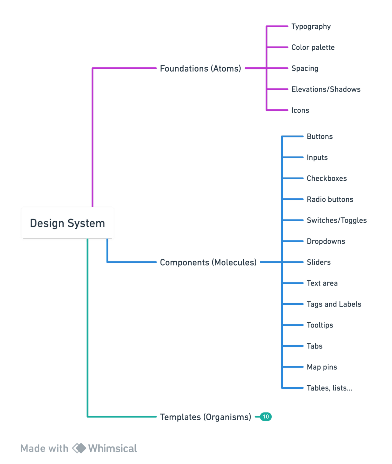
Foundations
In the foundations, I created color palettes, typography, and icons, and integrated them into Figma styles.
Components
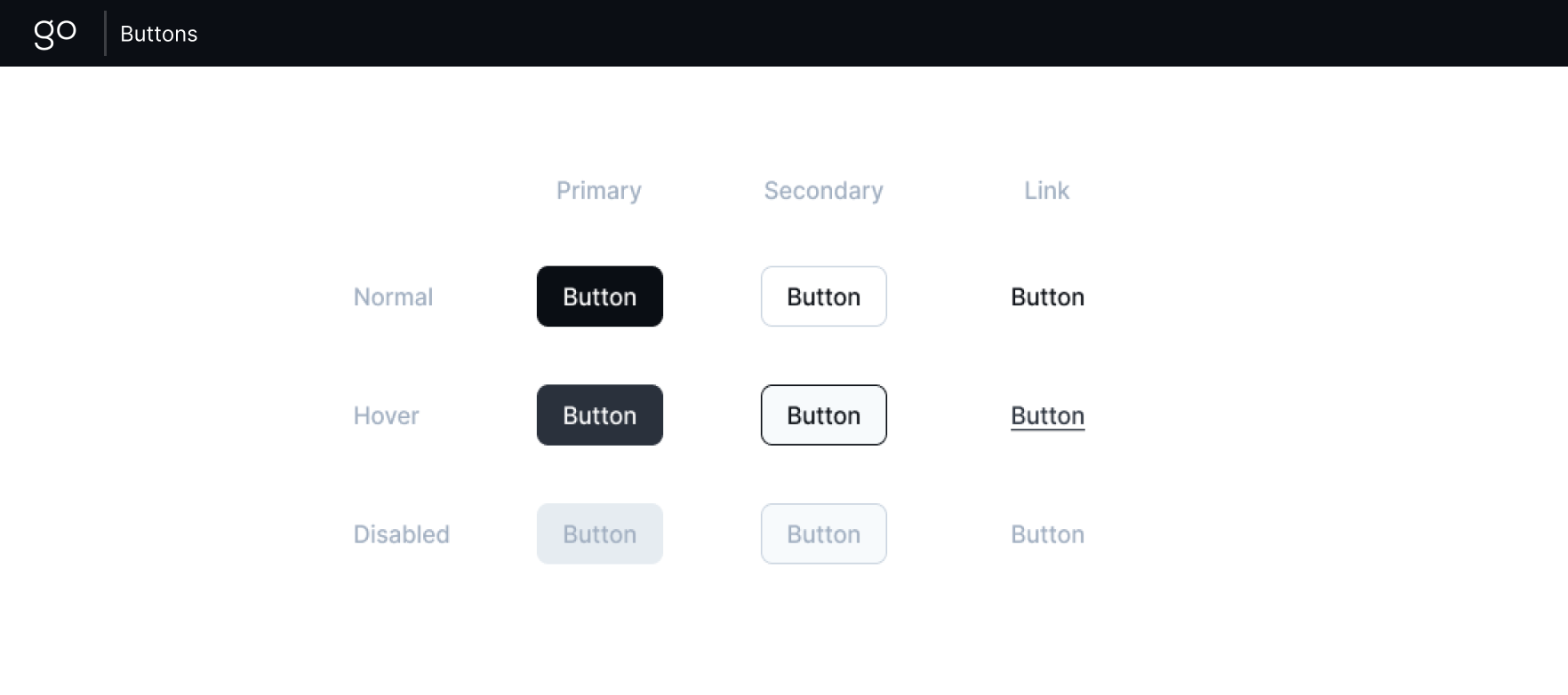
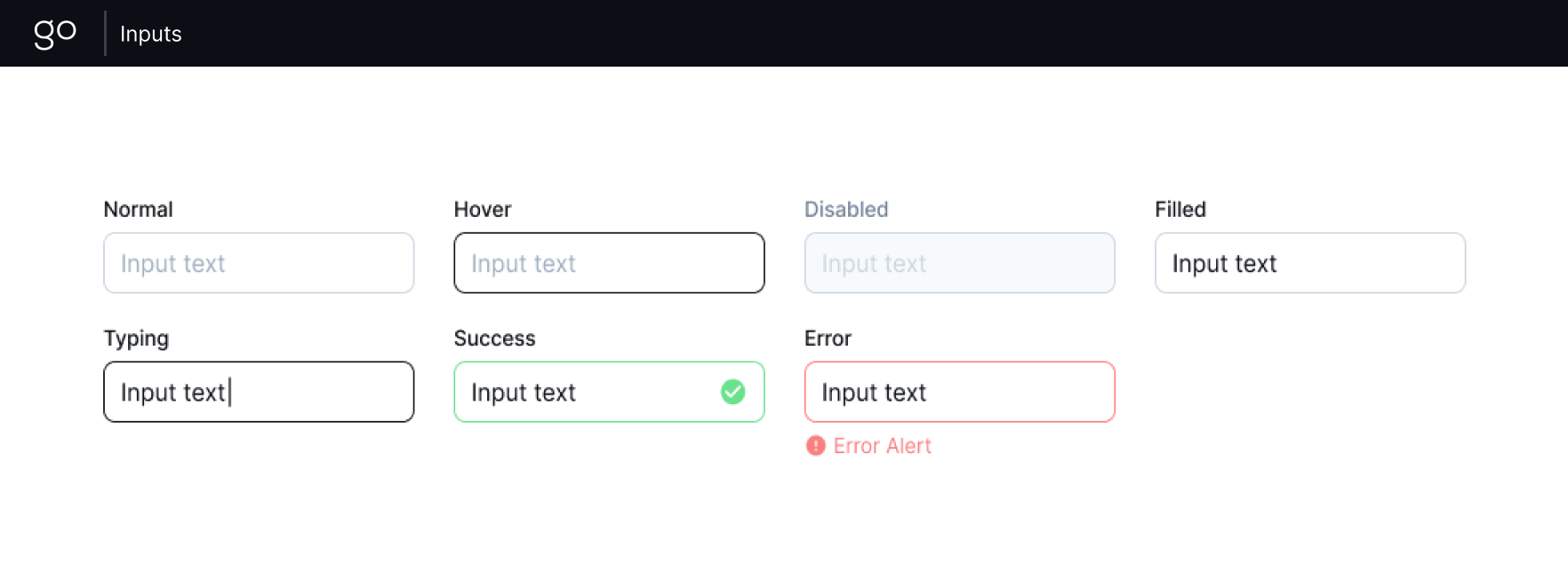
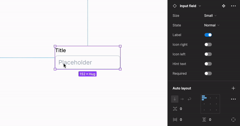
From buttons, input fields, and text areas to radio buttons, checkboxes, toggles, tags, avatars, tooltips, and sliders, each component is a carefully crafted element contributing to the cohesiveness.
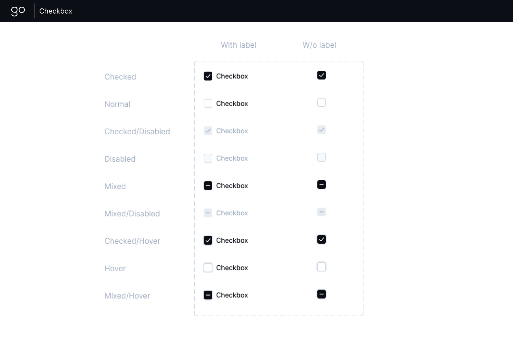
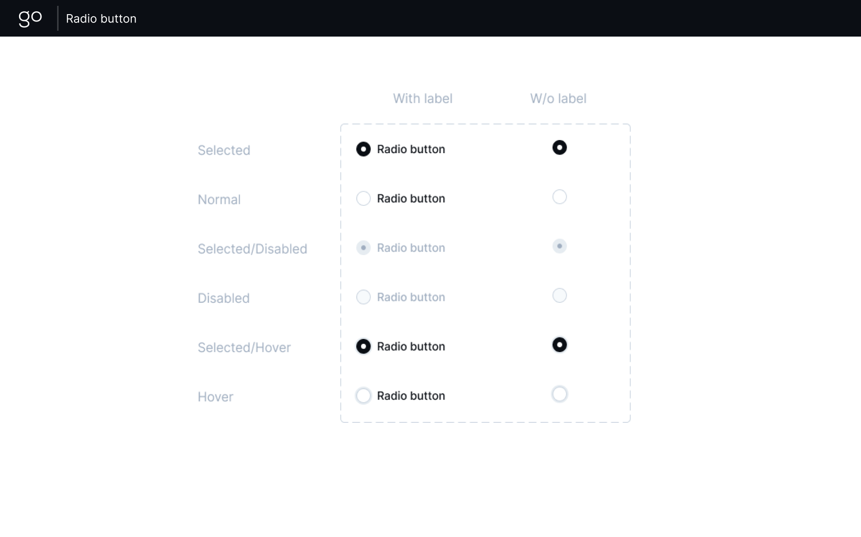
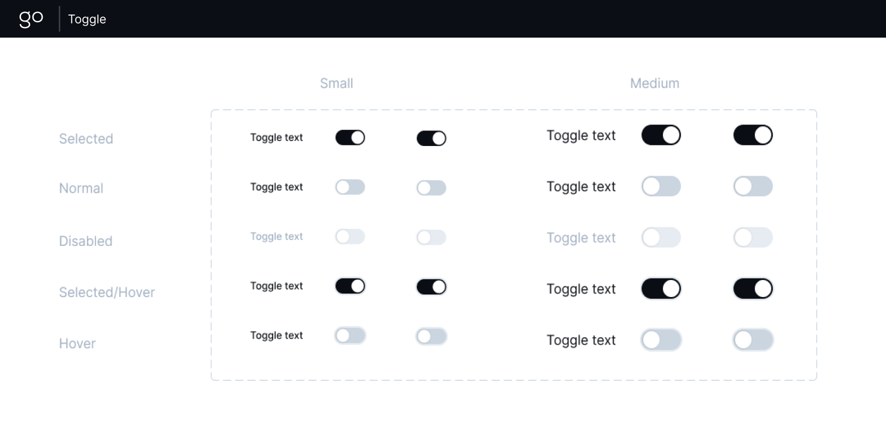
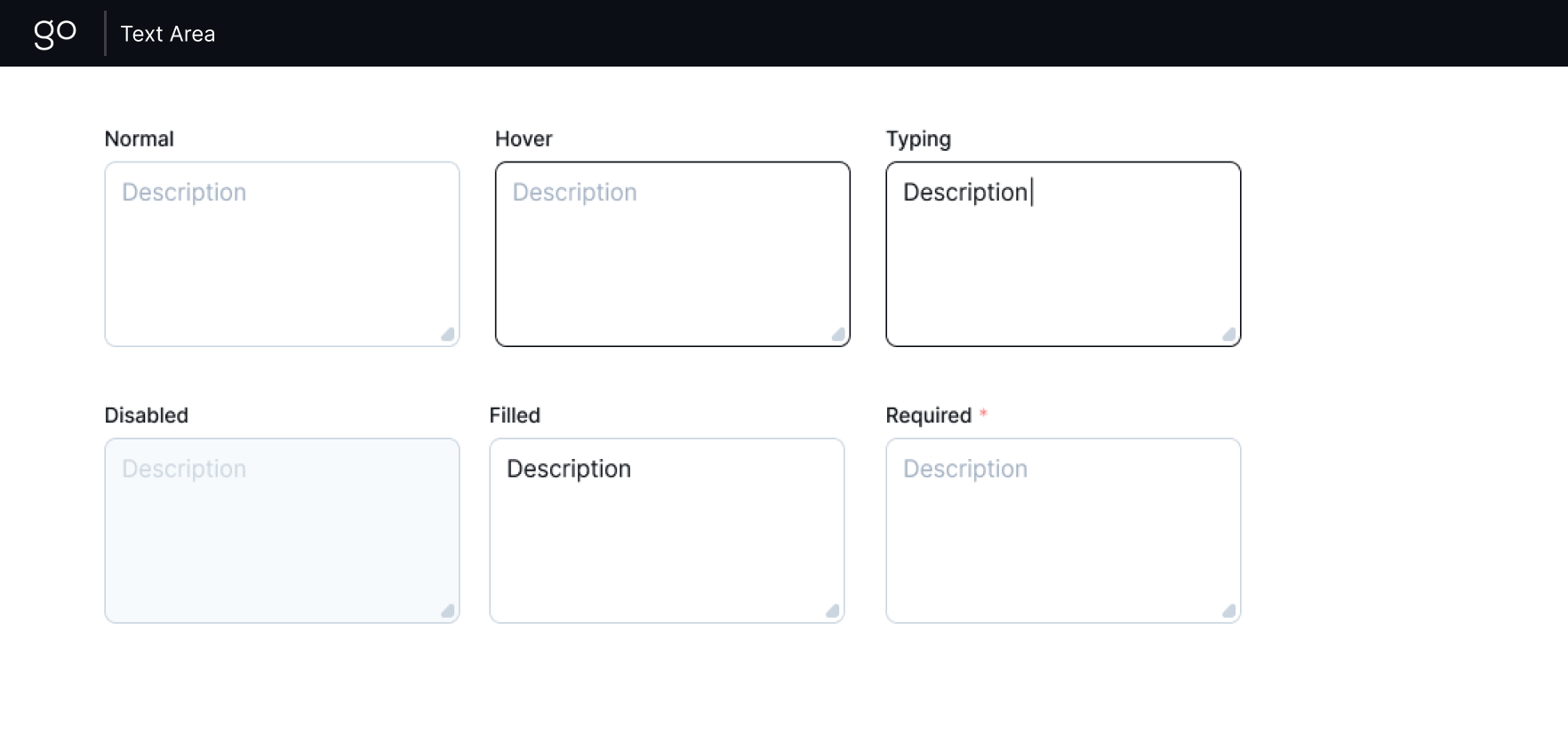
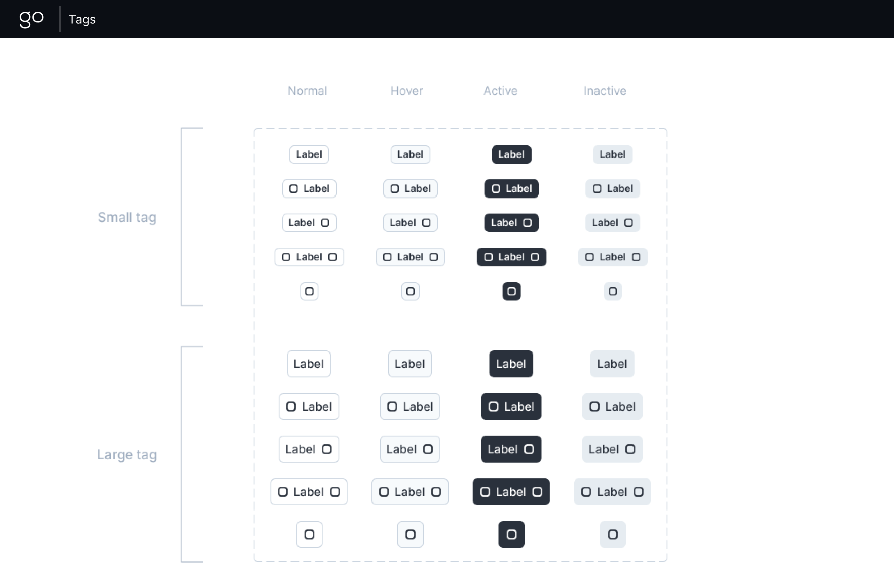
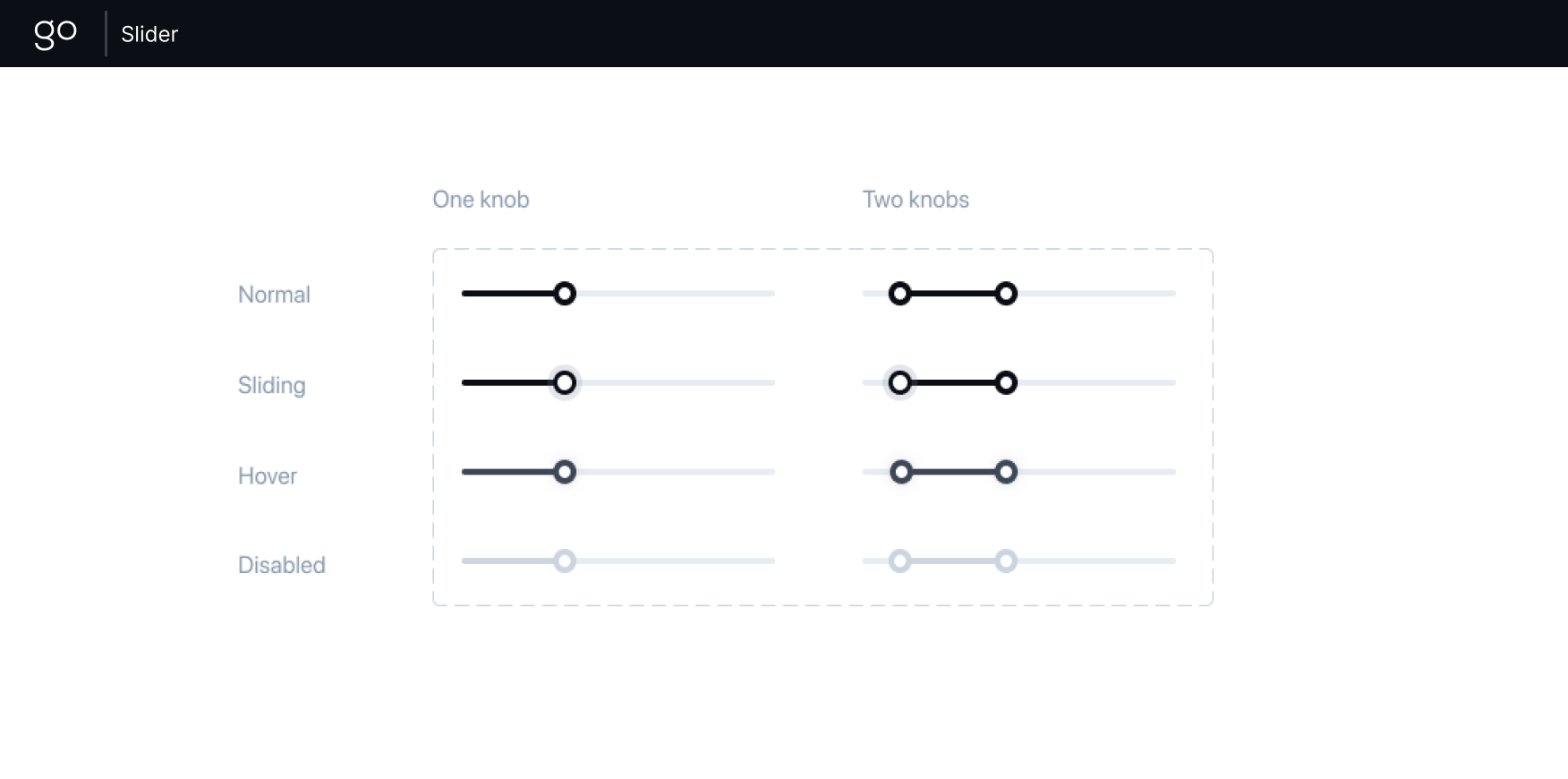
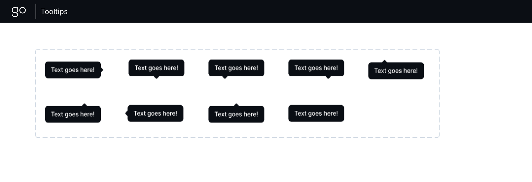
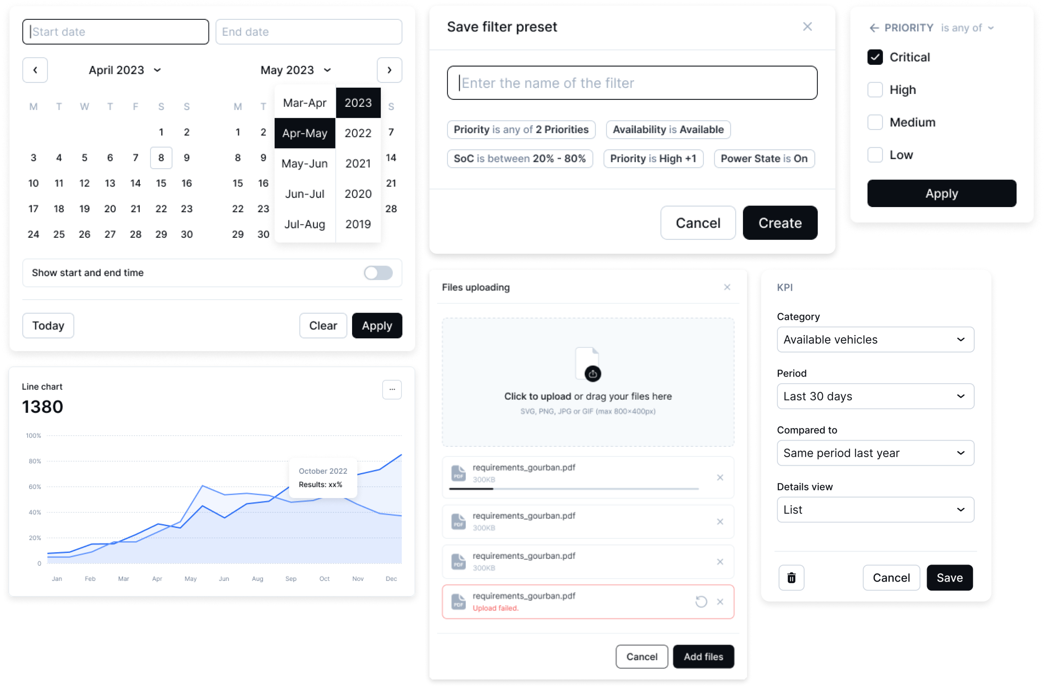
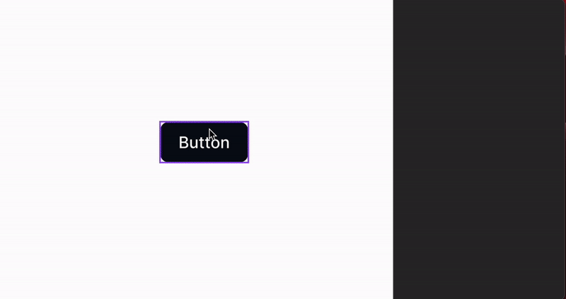
Components in action
In this section, I'm demonstrating component functionality and highlighting their variant configurations.
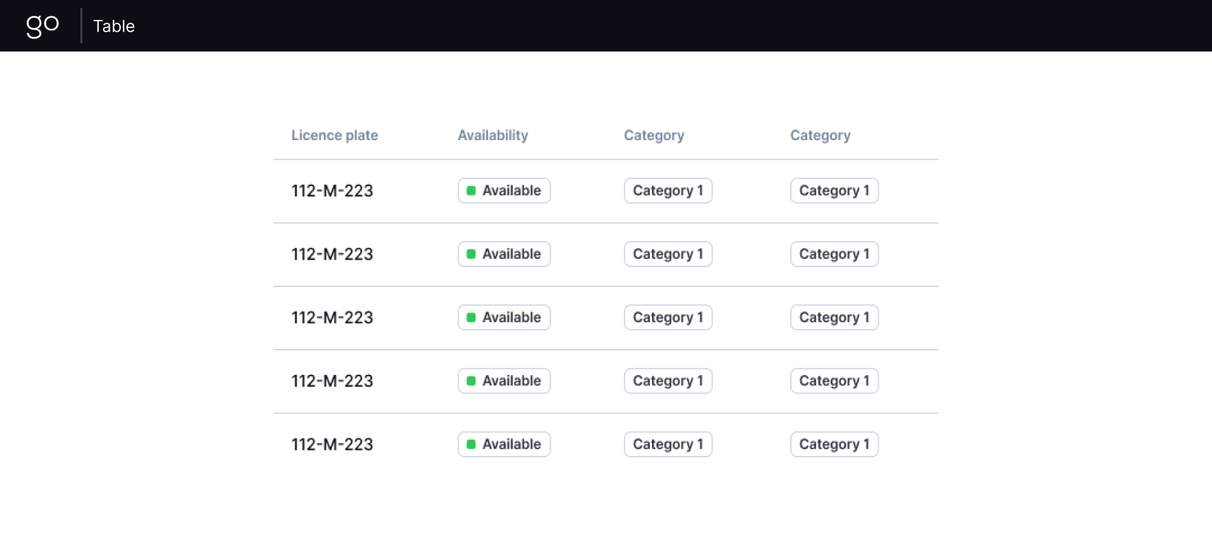
Templates
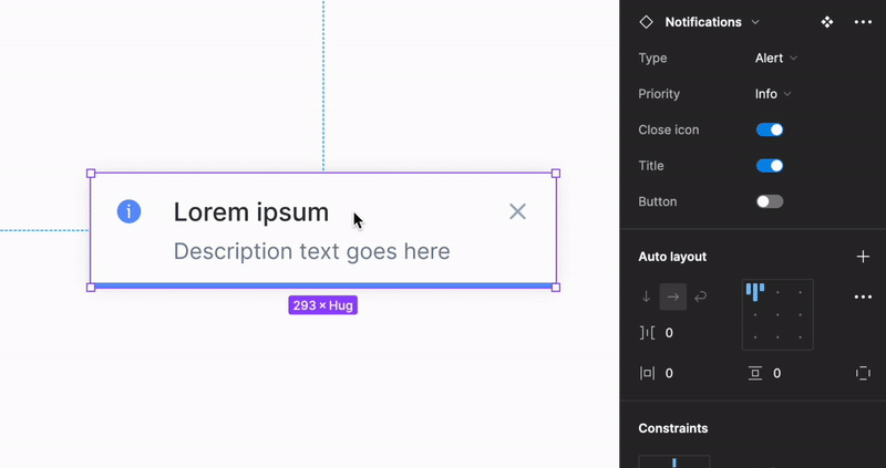
Templates are created from two or more components with flexible structure and customizable text/colors, eliminating the need for designers to spend time assembling repetitive elements such as headers, sidebars, and modals. Here are some of component templates: